This is part two of a two part series covering the app creation process. You can read Creating iOS App Ranger Golf GPS: Part 1 here.
Key features of Ranger Golf GPS
Ranger was created with a single goal: to be the definitive GPS app for the driving range.
I wanted Ranger to be really good at one specific thing, instead of trying to be just OK at a bunch of things. To make sure that happens, Ranger users are presented with the GPS Target Screen right from the start. But, even though I wanted to focus on one task, I did want to provide some additional value. Ranger users can also see the relative wind direction (see below) and weather forecast, view how-to info, modify basic settings, and provide feedback directly from the app.
Hopefully, Ranger can continue to grow and add new features in a smart way, without degrading or complicating the core function of the app. I plan to be cautious adding new features, but still want to keep enhancing the app over time. To help prioritize new features, I’ve setup A UserVoice account and encourage Ranger Users to post and vote on feature requests. I like the idea of community-driven enhancements and other apps, such as Infinite Flight, are doing a great job of allowing the users to help drive future enhancements.
GPS TARGET SCREEN

The primary function of Ranger is to provide accurate distances to any target on the driving range (or golf course) without a lot of taps, thought, or effort. To fulfill that promise, I decided to let the app fire up, ask for permission to find the user’s location, and then present the user’s position on top of the satellite view. In the beginning, I briefly considered leveraging a location DB like Foursquare, Yelp, Google, or others to show where the user was. But, quickly removed that feature because it would’ve complicated the development, cluttered the UI, and most importantly, provided limited benefit to users.
The main view controller contains the nav bar with 3 items: A lock button to lock your location (and save battery), the wind direction and speed (see below), and an info button that takes the user to the Help Screen and Settings.
At the top of the view, the user sees a brief overlay with the 3-step process to get your distance: Zoom In, Press your Target, Hit Great Shots. This overlay automatically hides itself after a user taps the map. The main target distance is displayed in large type right in the center. I chose dark type on a light background so it would be easy to see outside. The rest of the screen is uncluttered allowing Ranger users to see the map below.
All a Ranger user has to do is long press anywhere on the screen to automatically see the distance. They can drag the target to a new location or simply long press somewhere else to change the distance. The new yardage is automatically calculated and displayed at the top of the screen.
Wind Direction Indicator

Wind direction and speed is a very important consideration for golfers on the course and the range. Every 10mph of wind roughly affects the total distance by one club length. So if a 10 mph wind is straight into a golfer’s face, a shot that would normally require a 7i will now require a 6i. This is really important when practicing so you can get an accurate idea of how far you’re hitting the ball.
I wanted to find a way to bring wind direction and speed into the app without complicating the experience. To do this, I decided to leverage weather data from forecast.io, determine the current wind direction at the user’s location, get the current heading from Location Services, and display the MPH and the relative direction of the wind. This was a fun process to figure out.
Just showing the wind direction – East 10MPH or NW 10 MPH – really isn’t useful if you don’t know the direction you’re facing. Ranger actually displays the relative wind based on the direction the user is facing and automatically alters the direction as they move. The most basic example is if the user is facing North and the wind is from the West, the wind direction arrow will be pointing to the right, indicating that the wind is blowing left to right. This is extremely valuable information and it was fun to work out the automatic animation/rotation of the wind indicator in response to a heading change notification. Just don’t use Ranger GPS in a USGA-sanctioned event!
WEATHER FORECAST

I was originally interested in the Forecast.io weather API specifically for the wind direction feature. But the Forecast.io API is incredible and I wanted to find another legitimate reason to use the rest of the data. The data is insanely accurate, the API is solid, simple, and scalable, and the pricing structure is the best out there. The first 1,000 API calls per day are free and every 10k API calls after that cost just $1. Even though the API is straightforward, I leveraged a nice iOS library called ForecastKit to make the integration even easier.
I decided to create a Weather Forecast view. Instead of cluttering up the GPS Screen with another button, users can get to the the weather forecast by tapping on the wind indicator. The Weather view displays the current temperature, icon, and summary. Additionally, users can swipe through the weather icons for the next 9 hours. And since it’s important, the sunset time is also displayed.
I found a great set of beautiful and flat weather icons designed by Adam Whitcroft called Climcons.
HOW-To VIEW
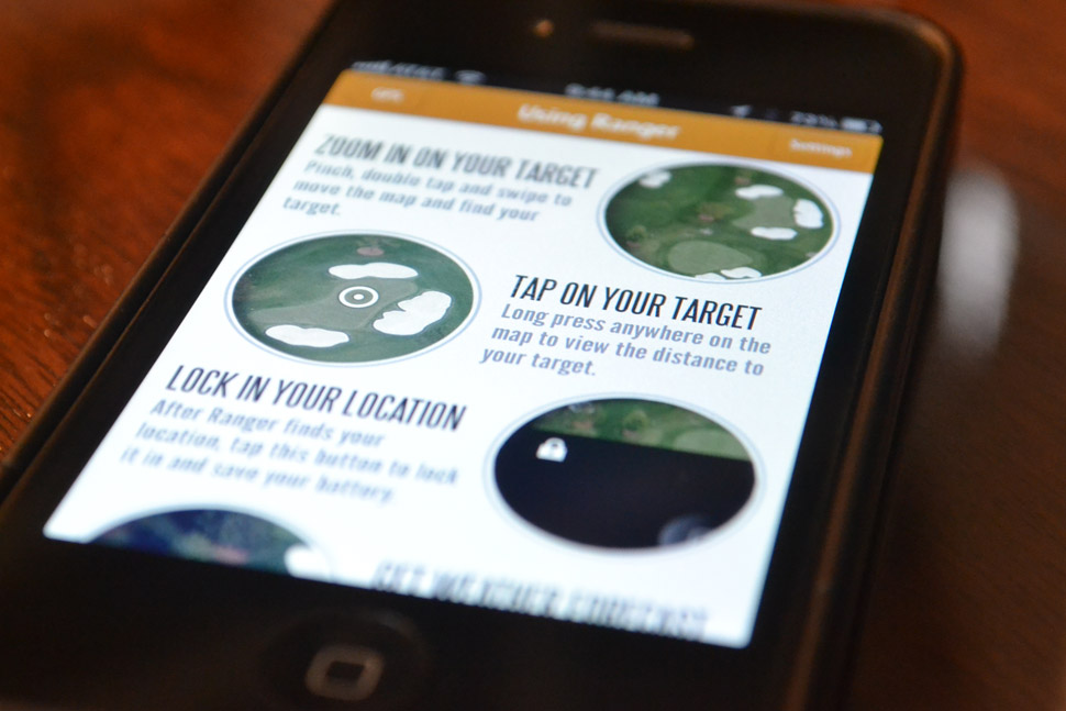
Ranger is a pretty simple app, but I wanted to include a hot-to section to make sure Ranger users wouldn’t be sitting there with the app wondering what to do. The design of the page is simple with limited text and an image highlighting key features.
Prior to launch, I assumed the majority of users would be in North America and Europe. But mostly USA. That turned out to be true, but I was surprised to see the app being used heavily in countries like Spain. Because the How-To view is one big image, localization won’t work. That means the help section of the site isn’t terribly useful if the user doesn’t speak english. In future updates, I’ll convert this to text and imagery to take advantage of localization.
Settings, App feedback and ideas

Since the app doesn’t require user login or many core features, the Settings View focuses on the distance measurement. Interestingly, the CLLocation class provides a method distanceFromLocation, which returns a distance between two points, but the distance returned is in meters. Ranger displays the target distance in yards by default, since that is the standard measurement in the United States, which required conversion. But, I wanted to make sure international users would find value, so users can change the measurement to meters or feet as well.
Since I decided to go all-in with this app, I wanted to give Ranger users a way to send feedback and get support. Any large-scale app would offer this functionality. I investigated a number of different feedback options including UserVoice, Apptentive, building my own, and others. Ultimately, I chose to go with a hybrid approach that would allow me to test out numerous services.
For in-app feedback, I chose Apptentive. They have a nice iOS SDK that is essentially drag and drop code. Specify a couple parameters and then trigger an overlay when a user taps feedback. With Apptentive, you can even allow screenshots to be attached. I looked at their ratings option, but had previously implemented iRate. That was a poor decision, as iRate has yet to trigger a Rating request. In the next update, I’ll be looking into why that is.
For the website, I wanted to offer a way to submit a feature request or support question. Uservoice seemed perfect. Their basic plan gives you a subdomain and the ability to customize aspects of the landing page. The support queue is easy to use, and Ranger users can submit and vote on feature requests. Right now, I haven’t brought in any Uservoice widgets into the getranger.com site, but I plan to. I do link to ranger.uservoice.com from the FAQ section of the site.
So far, I’ve had only one support question and one piece of feedback from the app, but both were actually positive comments and not support at all.
Beta testing with TestFlight
TestFlight is awesome. For anyone building an app, TestFlight should be the first service you sign up for after the Apple Dev Program. TestFlight makes it very easy to invite beta testers to try out your app. Instead of having to do all the provisioning, invites, and distribution on your own, TestFlight simplifies the process by handling the invite process, binary, and analytics.
TestFlight has an SDK making it very easy to receive analytics about the beta users. You can add checkpoints to know where your users travel and what they do in the app, you can see crash reports, session time, device information, and more. It’s simple for beta testers to get access to app updates and stay current as you continue through development. Can’t thank Ranger beta testers Chris, Andy, Mike, and Charlie enough for helping out.
ANALYTICS & APPROVAL PROCESS
Let’s start with the approval process. It took 5 total days. Prior to submitting the app for approval, I spent a lot time error checking, testing, and retesting the app in the iOS Simulator for non-retina, retina, and iPhone 5. I also tested on an iPhone 4S as well as continued to rely on beta tester feedback. I spent a lot of time reading the Apple App Store Review guidelines making sure I could check off every box. Once I submitted the app, I became obsessed with the status updates, which were very good from Apple and I watched http://reviewtimes.shinydevelopment.com/ to see the average review times, which proved to be spot on accurate.
I haven’t (and won’t) do any paid advertising to drive downloads, but I have done everything I can to optimize my App Store profile. From selecting the right keywords, to optimizing the title and first paragraph character lengths. I added screenshots for non-retina, retina and the 5 and all the individual app icon sizes recommended.
For analytics, I’m using Flurry. Originally, I wanted to continue to use TestFlight, with their new product FlightPlan. FlightPlan promised real-time app analytics and it would’ve allowed me to leverage the same checkpoints and code I used for the Beta Testing process. Unfortunately, FlightPlan was just launching and wasn’t producing the data I wanted during testing. I considered Google Analytics and Flurry. Either would’ve been good choices, but honestly, I wanted to try something new so I went with Flurry. Easy SDK to integrate and the same basic code as TestFlight to trigger sessions and events. The data isn’t in real-time, but I’m very impressed with the amount of data I have access to. And 300,000 other apps can’t all be making a mistake going with them.
Results so far

As for usage, I’m blown away. I really did create this app because a few of us hardcore golfers wanted it. If we were the only people who used it and got value from it, that would’ve been fine with me.
Since launching on May 25th, the app has been downloaded over 1,500 times in 39 different countries and all used in all 50 states. Ranger users have fired up the app over 8,000 times, spent over 150 hours in the app, and found distances to over 25,000 targets. Ranger is currently averaging over 30% active users, 2.8 sessions/ week and over 100 active users/day. The United States and UK have the most active users, with California and London providing the most active users in each country.
I didn’t anticipate the app being downloaded in so many countries and I didn’t spend much time worrying about localization. The app employs the basic localization, but in future updates, I will need to change the Help Screen from being a solid image, to being a text/image hybrid, which will allow the app to be much more multi-language friendly.
These results might seem sad to some developers, but this is truly just a fun side project and I couldn’t be happier with the results. This project gave me a reason to investigate many different products, experiment more with iOS, and ultimately saved me and few others from having to spend $250 on a laser rangefinder! It will be fun to see where Ranger Golf GPS goes from here.


